Who this post is for
Designers and people who supply images to printers and want to provide the best image possible without a lot of technical complication. Also, printers who receive poor quality images who want to help their customers tweak images to get a better result.
The software
I'm using PhotoShop CS3, but any image editing software that is capable of doing these basic manipulations will work.
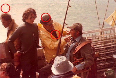
The image
I'll be using this image:
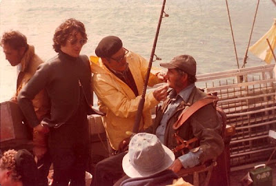
because it has, I hope you can see, some obvious color problems. The image is from the daughter of make-up man Harry Buchman who worked on the movie "Jaws."
The 8 basic steps
There are many ways and tools that achieve the same or similar results - most are very simple, but like anything they can be made more complicated. This following is a basic, pragmatic, method to getting better images for reproduction.
These are the 8 steps:
1) Check the computer monitor display to make sure that it is representing the tone scale correctly.
2) Check the computer monitor display to make sure that it is representing neutrals correctly.
3) Check the image resolution.
4) Set the color target.
5) Adjust color
- with an "auto-correction".
- with a manual correction.
6) Set Black and white points.
7) Adjust contrast.
8) Sharpen image and save (under a new name).
Step One - the tone scale
Download this graphic and open it in your image editing application:

You should see a 21 step ramp going from 0% on the left to 100% black on the right. The black should look black and the white look white. You should be able to distinguish every patch of grey separate from each other however it is acceptable if the last two patches (95% and 100%) blend together.
Step Two - neutrality
The patches of grey in the graphic should all look neutral.
If your display passes #1 and #2 then you're good to go. If not, you may need more sophisticated help.
Step Three - image resolution
Check the image resolution. Typically the image size is based on a resolution of 72 pixels per inch (a.k.a. 72 dpi):
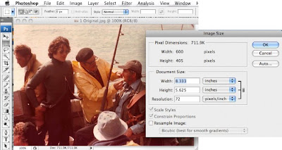
This image is sized at 8.333" x 5.625" at 72 pixels per inch. 72 pixels per inch is pretty standard for web pages. For printing, a higher resolution is required. Changing the resolution of this image to 300 pixels per inch with "resample" not selected:
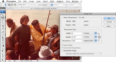
shows that this image is only suitable to be reproduced in print at a size of 2" x 1.35". An image resolution of 300 pixels per inch (a.k.a. 300 dpi) at 100% reproduction size is quite standard for print application.
Step Four - set the color target
This tells the image editing application what the intent, or final destination, of the image is and helps it to display the image correctly. The color target is embodied in a color profile.
The two most common color profiles used are:
1) sRGB - which is used for images destined for the web or printed on desktop inkjet and photofinishing printers.
2) Adobe 1998 - which is used for images destined for print reproduction.
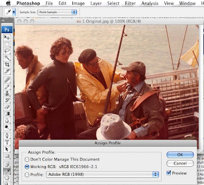
By default, most digital cameras embed the sRGB profile. It can be reassigned to the Adobe 1998 profile if the destination is a printing press.
Step Five - adjust color
Auto-correction
Many image editing applications have an auto-correction capability:

Sometimes that will give an acceptable result or one that can be a base for further work:

Auto-correction tends to work best with images that contain a great variety of colors.
OR
Manual-correction
Manual color correction takes four steps:
1) identify neutrals
2) neutralize mid-tones
3) neutralize shadow-tones
4) neutralize highlight-tones
This image contains several likely neutrals:
The highlights on the water, the midtones of the beret, the shadow-tones in the darkest part of the vest.
Use the eyedropper tool to measure the RGB values of the mid tones in the beret:
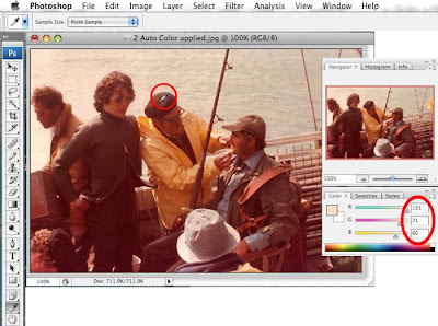
The eyedropper indicates that the RGB values in this part of the image is:
R 131
G 71
B 60
The large number for RGB relative to the G and B values indicates that the image has a red cast (too much red). To be neutral grey the RGB values should be similar. By adjusting the RGB color values so that they are similar makes the mid-tones represented by this area of the image neutral:
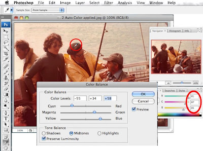
It's not important that the RGB values are absolutely identical - close enough is good enough.
In this case the final RGB values are:
R 81
G 87
B 85
Note that the color adjustment is balanced in that Red is lowered while Green and Blue are increased.
Repeat the color adjustment, using the same procedure for the highlights and the shadows.
The result:
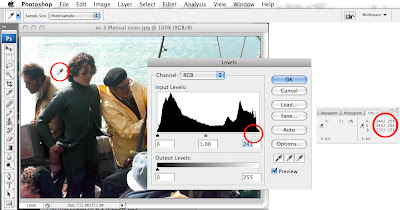
 Step Six - adjust black and white points
Use the "eye dropper" tool in concert with the "Show Info" dialog box to get the RGB values of the specular highlights. Highlights that should be absolutely white with no detail:
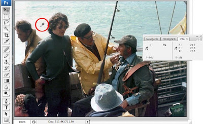
Pure, no detail white should have RGB values of 255 each. This image's values are:
R 242
G 235
B 235
Which means that although they may appear white - the highlights are actually grey. Adjusting the highlights using the "level adjustment" option sets the highlights to their appropriate values:
The same thing would then be done to the darkest black in the image which should be close to:
R 0
G 0
B 0
The result:
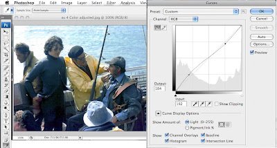
 Step Seven - adjust contrast
Adjusting contrast changes the relationship of the tones of the image making it appear "harsher" or "softer. The "Curves" menu option is used to alter contrast:
 Step Eight - sharpen image and save (under a new name)
The final steps are to "sharpen" the image (of which there are many different methods):
In general, images destined for the web should be sharpened enough so that they look "natural". Images destined for print should appear slightly over-sharpened, a bit harsh looking because halftoning has a bit of a softening effect on images.
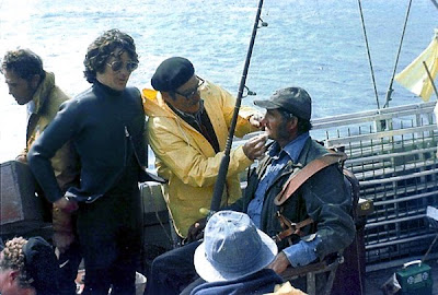
So, following these "simple" 8 steps, here's where we started:

And here's where we ended:

Obviously more work could be done on the image. Other, more sophisticated, methods could be used. However following these simple 8 steps should provide much better results for those people who don't want to get too technically involved.
 And here's a microscope view (also 200x) of a 20 micron FM screen:
 vs the thinner FM:
 Using color mapping instead of the actual ink color makes the difference in ink film thickness even clearer (yellow = greatest - blue= lowest ink film density):
 Lowering the viewpoint and warping the perspective of the 175 lpi AM/XM screen begins to turn the image into a kind of landscape:
  However, using terrain mapping software on those original microscope images of the AM/XM and FM screens really makes the transformation of the images into proper landscape views a reality.


