 True sales professionals establish and develop their skills to manage a complex sales scenario. They typically enter a buying culture that positions print as an undifferentiated commodity. As a result, the sales professional must use their ability to collect customer and job data, uncover broader business issues, develop solutions from their expert standpoint, and then develop the strategies required to align the printer’s production system to deliver the appropriate solution. Sales must also endeavor to make buyers realize their payback – the value proposition – they derive from the printer’s uniqueness. This allows Sales to sell more of the value of their solution, which in turn will give the print buyer more effective print communication pieces while helping the printer maintain their margins along the way. As this process develops over time, the sales person gets to know the account intimately and learns how to shape the printer’s solutions so that they evolve with the print buyer’s needs and always form the right fit. When Sales only has one print solution or standard, it makes it hard to tailor it to meet customer needs. One print-production method and presswork standard, SWOP or GRACoL for example, may save time and cost in the cases when just that solution fits the customer’s needs just right, but otherwise it may push the sales person and the printer further into a commodity position where price is the sole differentiator.
Wednesday, September 30, 2009
A "Marketing Services Provider" approach to print sales
True sales professionals establish and develop their skills to manage a complex sales scenario. They typically enter a buying culture that positions print as an undifferentiated commodity. As a result, the sales professional must use their ability to collect customer and job data, uncover broader business issues, develop solutions from their expert standpoint, and then develop the strategies required to align the printer’s production system to deliver the appropriate solution. Sales must also endeavor to make buyers realize their payback – the value proposition – they derive from the printer’s uniqueness. This allows Sales to sell more of the value of their solution, which in turn will give the print buyer more effective print communication pieces while helping the printer maintain their margins along the way. As this process develops over time, the sales person gets to know the account intimately and learns how to shape the printer’s solutions so that they evolve with the print buyer’s needs and always form the right fit. When Sales only has one print solution or standard, it makes it hard to tailor it to meet customer needs. One print-production method and presswork standard, SWOP or GRACoL for example, may save time and cost in the cases when just that solution fits the customer’s needs just right, but otherwise it may push the sales person and the printer further into a commodity position where price is the sole differentiator.
Sunday, September 27, 2009
Adding value beyond print – Japs-Olson Co.
One of the popular topics at Print '09 concerned printers adding value beyond just ink-on-paper. As the 1950s advertising ruler that I bought on my trip to the show demonstrates, the idea of including services going beyond print is not a new idea. In this case, the Japs-Olson company, in addition to printing and stationery, offers...furniture!

"Click image to enlarge"
Other print advertising rulers can be seen by clicking HERE

Saturday, September 19, 2009
Print '09 - Final thoughts
 PRINT 09 drew a total 18,999 actual verified attendee/buyers who were greeted by 9679 booth sales and demo personnel. Put another way, there was about one vendor representative for every two attendees.
I thought it was a pretty good show - but not very much was causing any show floor buzz - no "oh wow did you see what they've got/doing/showing at booth xyz."
Most of the folks I spoke with felt that the Kodak booth was high on flash but low on making their solutions or products visible. "No substance" was a term I heard several times. Very hard to discover what was new or exciting in their product line up. A great many people either couldn't figure out how to use the RFID triggered displays (and other displays), or once they did weren't that impressed by the content. "Why go to a tradeshow to see what you could see on the web?"
The outstanding thing for me at the Kodak booth was their ONE magazine which demonstrated Staccato screening printed with flexo. It was easy to miss if you didn't read the production notes - and there wasn't, to my knowledge, any reference in their booth to this amazing technology that I'm sure that flexo printers would have wanted to know more about.
BTW MAN-Roland also had no equipment in their booth (but without the fanfare). - Their solutions were very well displayed and articulated.
Agfa, Screen, Heidelberg, and Fuji all had very standard booths (not that there's anything wrong with that) - and probably the only ones that showed CtP devices.
It was great finally seeing the Xingraphics no-process plate - but I'll bet many people missed that.
There was a very strong and well organized presence from Chinese suppliers - they're coming on much stronger than in previous years.
East Indian print and prepress suppliers were represented for the first time - but, unfortunately, not that well IMHO. The fellow staffing their booth had a great deal of difficulty with English - which I though was quite odd.
I was surprised and disappointed that Esko didn't have a booth at this show. I'm not sure that they were that well represented by their partners – at least when I tried to get information.
Some presenters seemed to pop up at different booths (Barb Pellow comes to mind) making the same pitch about printers should transform into becoming a variable/personalized/marketing services provider rather than just a printer. As a result, the message seems interchangeable between vendors like Kodak, Canon, Xerox, et al. No vendor differentiation. Also, in Kodak's case, out of some twenty roundtable-type K-Zone presentations there were no solutions stories for other market segments - e.g. publication, packaging, commercial printers who don't want to go down the road of variable transactional marketing.
If I hear one more call to "Tweet or die" I'll explode.
Personally, it was great for me to finally be able to visit vendor's booths, like Agfa's without being thrown out. Actually, I lie, Agfa was always gracious about competitors, like the former me visiting their booth - the other vendors not so much though.
The show itself was better promoted and organized than previous years.
The food was just as expensive and mediocre.
Due to the poor attendance there were no lineups at the cafeteria check-outs - and plenty of seating was available.
Thankfully the weather turned from the originally predicted thunderstorms and rain to very pleasant sunny days. I hope a good omen for our industry.
All in all, a very sedate show which required more effort on the part of attendees to extract the value of attending than previous years.
Saturday, September 12, 2009

Print '09 - Day 2
The Kodak booth caused quite a preshow brouhaha because they weren't going to display any physical equipment at the show. Their booth was quite Zen-like in its black simplicity: Althought it's their first version of a solutions vs boxes type booth, unfortunately many Kodak booth visitors, it seems, could not figure out what they were supposed to do to get the info they came to the show to get.
Interestingly the most innovative booth award may be given to EskoArtworks who, not only were not showing any equipment, but whose booth was so virtual it was invisible. I.e. they are not exhibiting at Print '09 at all, despite the show's heavy packaging focus.
At every GraphExpo/Print show there is a Chinese presence. However, this year it appears much stronger and better organized – although still quite poorly visited.
At least show attendance is up with the number of attendees probably equaling the number of sales people.
 Althought it's their first version of a solutions vs boxes type booth, unfortunately many Kodak booth visitors, it seems, could not figure out what they were supposed to do to get the info they came to the show to get.
Interestingly the most innovative booth award may be given to EskoArtworks who, not only were not showing any equipment, but whose booth was so virtual it was invisible. I.e. they are not exhibiting at Print '09 at all, despite the show's heavy packaging focus.
At every GraphExpo/Print show there is a Chinese presence. However, this year it appears much stronger and better organized – although still quite poorly visited.

At least show attendance is up with the number of attendees probably equaling the number of sales people.
Friday, September 11, 2009
Print '09 - Day 1
Today was the first full exposition day of Print '09 in Chicago.
(Click on images to enlarge)
Entrance to McCormick Place: Main entry hall:
 Despite the excellent efforts of the Print '09 organizers, the economy has certainly taken its toll on attendees. The Agfa booth made use of cardboard cutouts to boost booth attendance:
 Xerox's excellent presentation on green issues for the printer, like many of the presentations at the various vendor booths, had somewhat limited attendance:
 And this photo shows the general lack of attendees on the afternoon of opening day:
 Hopefully attendance will improve over the next few days.
(Click on images to enlarge)
Entrance to McCormick Place:
 Main entry hall:
 Despite the excellent efforts of the Print '09 organizers, the economy has certainly taken its toll on attendees. The Agfa booth made use of cardboard cutouts to boost booth attendance:
 Xerox's excellent presentation on green issues for the printer, like many of the presentations at the various vendor booths, had somewhat limited attendance:
 And this photo shows the general lack of attendees on the afternoon of opening day:
 Hopefully attendance will improve over the next few days.
Thursday, September 10, 2009

Tuesday, September 8, 2009
What a fake invoice can teach about color perception and graphic design best practices
Below is a fake invoice that was sent out in the hopes that the receiver - likely a secretary in a large business - would pay, since it appears legitimate and is for a relatively small amount.
Click on images to enlarge
 Note that all the commands to pay use colors that have a strong tonal contrast with their background – white against dark blue, black against light blue or white. However, the disclaimer that reveals that this is not an actual invoice but a solicitation to accept an advertising offer is printed using color contrast rather than tonal contrast – yellow lettering against a blue background.
 The designer of this "invoice" has effectively leveraged an aspect of human vision that puts a priority on tonal contrast rather than color contrast. By making the tone of the yellow disclaimer virtually identical to the screen tint of the blue background – the text effectively disappears, or at best becomes very hard to see/read.
Less sophisticated designers usually, and wrongly, believe that color contrast is a way to make text stand out from its background, i.e. they typically believe that the color contrast of yellow against a blue background should make text stand out and be more readable.
Interestingly, the give-away, in this example, is that a slight misregistration of the yellow text against the light blue background has increased the contrast of the letter edges slightly and made the disclaimer, just barely, more visible/readable.
Saturday, September 5, 2009

Wednesday, September 2, 2009
Creating crazy custom halftone screens
In a previous post (HERE) I described how to make a custom halftone dot shape. In this post I'll show you how to apply a pattern to an entire image to halftone it. In this case the halftone pattern will be very coarse so as to give the final result a strong graphic look. Click on the images below to enlarge them and eliminate any moiré caused by your monitor display.
First select an image to work with. The best images for this treatment are ones that fairly contrasty and have simple, easy to recognize, image content like this one: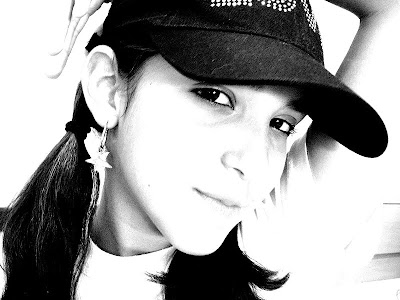 Then create the pattern you want to use to halftone the image using a vector illustration application like Adobe Illustrator. For this example I've created a concentric circles graphic.
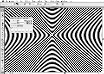 Note that the black and white line thickness of the pattern are about equal. As usual, you will need to experiment to get the right combination of image and pattern resolution to achieve a good effect – there are no rules.
In Photoshop, open the image you want to halftone. Then open the pattern that you've created and copy and paste it into a layer above your image. Make sure the image is in greyscale mode. Create a new layer below the pattern, fill it with white and then merge the pattern with the white layer. At this point you will have two layers; one layer with the original image and above it one layer containing the pattern.
Apply a Gaussian Blur to the pattern. In the below image the original pattern is on the left side and the Gaussian Blur applied pattern is on the right: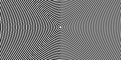 What you are trying to do is maintain the integrity of the pattern while creating a "threshold array" of about 256 levels of grey.
Next, if the pattern needs to align with any image content then position the pattern accordingly. In this case I've centered the circular pattern over the woman's eye. Then set the pattern layer to "Hard Mix" - the result will look something like this: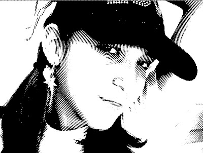
At this stage, if the results are too contrasty or flat, select the image layer and use the "Curves" menu to adjust the original image's contrast to get the effect you like: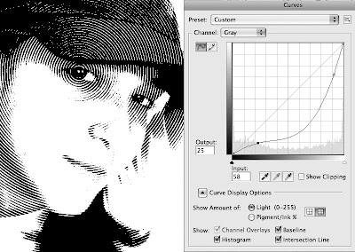
Finally, when you are happy with the result, merge the two layers. Then convert the image to "Bitmap Mode" (using "50% Threshold") to make sure there are no grey levels left that might get screened by a RIP. Your result will look somewhat like this: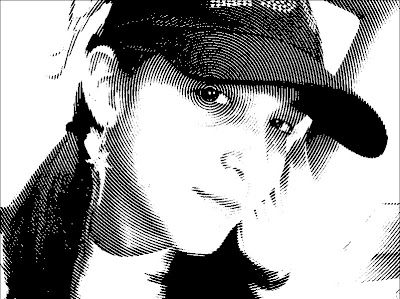 ...and ready to place in a page layout.
You can use any pattern your imagination comes up with.
For example, this one uses wavy lines: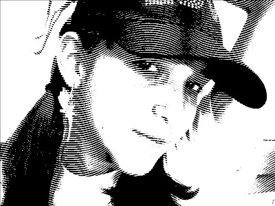 While this one uses a hexagon pattern instead of concentric circles:
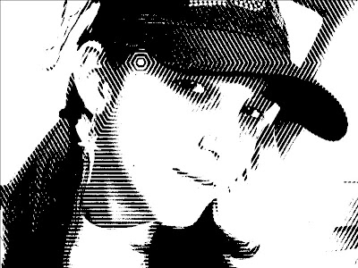
First select an image to work with. The best images for this treatment are ones that fairly contrasty and have simple, easy to recognize, image content like this one:
 Then create the pattern you want to use to halftone the image using a vector illustration application like Adobe Illustrator. For this example I've created a concentric circles graphic.
 Note that the black and white line thickness of the pattern are about equal. As usual, you will need to experiment to get the right combination of image and pattern resolution to achieve a good effect – there are no rules.
In Photoshop, open the image you want to halftone. Then open the pattern that you've created and copy and paste it into a layer above your image. Make sure the image is in greyscale mode. Create a new layer below the pattern, fill it with white and then merge the pattern with the white layer. At this point you will have two layers; one layer with the original image and above it one layer containing the pattern.
Apply a Gaussian Blur to the pattern. In the below image the original pattern is on the left side and the Gaussian Blur applied pattern is on the right:
 What you are trying to do is maintain the integrity of the pattern while creating a "threshold array" of about 256 levels of grey.
Next, if the pattern needs to align with any image content then position the pattern accordingly. In this case I've centered the circular pattern over the woman's eye. Then set the pattern layer to "Hard Mix" - the result will look something like this:

At this stage, if the results are too contrasty or flat, select the image layer and use the "Curves" menu to adjust the original image's contrast to get the effect you like:

Finally, when you are happy with the result, merge the two layers. Then convert the image to "Bitmap Mode" (using "50% Threshold") to make sure there are no grey levels left that might get screened by a RIP. Your result will look somewhat like this:
 ...and ready to place in a page layout.
You can use any pattern your imagination comes up with.
For example, this one uses wavy lines:
 While this one uses a hexagon pattern instead of concentric circles:
Tuesday, September 1, 2009
Quality printing versus production efficiency
 Quality, in terms of meeting customer expectations, and production efficiency are often seen as incompatible. It is either/or, you can’t have both. However, the fact is that quality is achieved by improvement of the process. Improvement of the process increases the uniformity of production, reduces mistakes, increases production effectiveness, and reduces waste of effort, time, and materials. Reduction of waste and inefficiencies, in turn, transfers work and machine hours from the manufacture of defective materials – with their associated reworks – into the manufacture of additional good products. In effect, production capacity is increased. The benefits of better quality through improvement of the print manufacturing process are therefore not just better quality, and the long-range improvement of competitive market position that goes along with it, but greater productivity and better profitability as well. Enhanced employee morale is another gain as increased pride in their work and a greater sense of security result from seeing their efforts improve the success and competitive position of the company.
Subscribe to:
Posts (Atom)